Advanced Data Visualization Homework
(Refer back to the Advanced Data Visualization lesson).
Key Concepts
- geoms
- aesthetic mappings
- statistical layers
- scales
- ggthemes
- ggsave
Getting Started
The data we’re going to look at is cleaned up version of a gene expression dataset from Brauer et al. Coordination of Growth Rate, Cell Cycle, Stress Response, and Metabolic Activity in Yeast (2008) Mol Biol Cell 19:352-367. This data is from a gene expression microarray, and in this paper the authors are examining the relationship between growth rate and gene expression in yeast cultures limited by one of six different nutrients (glucose, leucine, ammonium, sulfate, phosphate, uracil). If you give yeast a rich media loaded with nutrients except restrict the supply of a single nutrient, you can control the growth rate to any rate you choose. By starving yeast of specific nutrients you can find genes that:
- Raise or lower their expression in response to growth rate. Growth-rate dependent expression patterns can tell us a lot about cell cycle control, and how the cell responds to stress. The authors found that expression of >25% of all yeast genes is linearly correlated with growth rate, independent of the limiting nutrient. They also found that the subset of negatively growth-correlated genes is enriched for peroxisomal functions, and positively correlated genes mainly encode ribosomal functions.
- Respond differently when different nutrients are being limited. If you see particular genes that respond very differently when a nutrient is sharply restricted, these genes might be involved in the transport or metabolism of that specific nutrient.
You can download the cleaned up version of the data at the link above. The file is called brauer2007_tidy.csv. Load the ggplot2, dplyr, readr packages, and read the tidy Brauer data into R using the read_csv() function (note, not read.csv()). Assign the data to an object called ydat.
Note, the code is available by hitting the “Code” button above each expected output, but try not to use it unless you’re stuck.
# Load required libraries
library(readr)
library(dplyr)
library(ggplot2)

# Read data from file
ydat <- read_csv("data/brauer2007_tidy.csv")

# Display the data
ydat
## # A tibble: 198,430 x 7
## symbol systematic_name nutrient rate expression
## <chr> <chr> <chr> <dbl> <dbl>
## 1 SFB2 YNL049C Glucose 0.05 -0.24
## 2 <NA> YNL095C Glucose 0.05 0.28
## 3 QRI7 YDL104C Glucose 0.05 -0.02
## 4 CFT2 YLR115W Glucose 0.05 -0.33
## 5 SSO2 YMR183C Glucose 0.05 0.05
## 6 PSP2 YML017W Glucose 0.05 -0.69
## 7 RIB2 YOL066C Glucose 0.05 -0.55
## 8 VMA13 YPR036W Glucose 0.05 -0.75
## 9 EDC3 YEL015W Glucose 0.05 -0.24
## 10 VPS5 YOR069W Glucose 0.05 -0.16
## # ... with 198,420 more rows, and 2 more variables: bp <chr>, mf <chr>Problem Set
Follow the prompts and use ggplot2 to reproduce the plots below.
Part 1
We can start by taking a look at the distribution of the expression values.
- Plot a histogram of the expression variable, and set the bin number equal to 100.
ggplot(ydat, aes(x = expression)) +
geom_histogram(bins = 100) 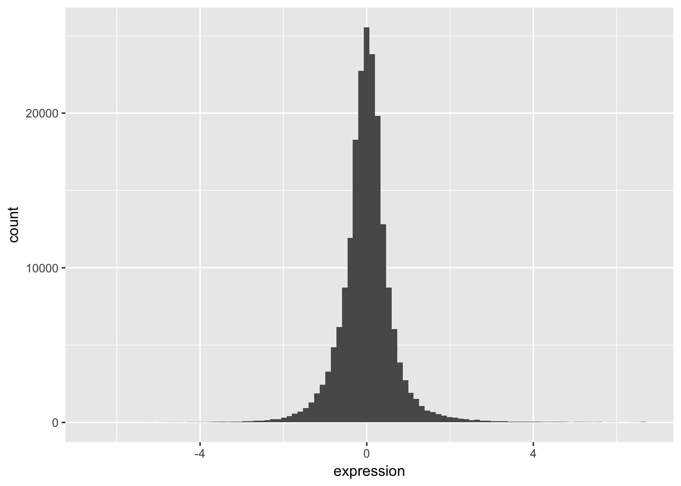
- Check the distribution of each nutrient in the data set by adjusting the fill aesthetic. Use the same bin number for this histogram.
ggplot(ydat, aes(x = expression, fill = nutrient)) +
    geom_histogram(bins = 100)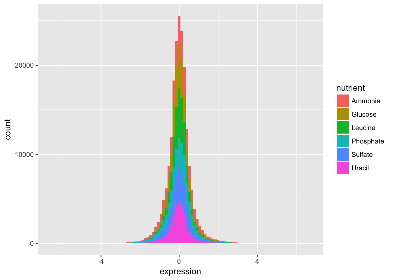
Wow. That’s ugly. Might be a candidate for accidental aRt but not very helpful for our analysis.
- Now split off the same histogram into a faceted display with 3 columns.
ggplot(ydat, aes(x = expression, fill = nutrient)) +
    geom_histogram(bins = 100) +
    facet_wrap(~ nutrient, ncol = 3)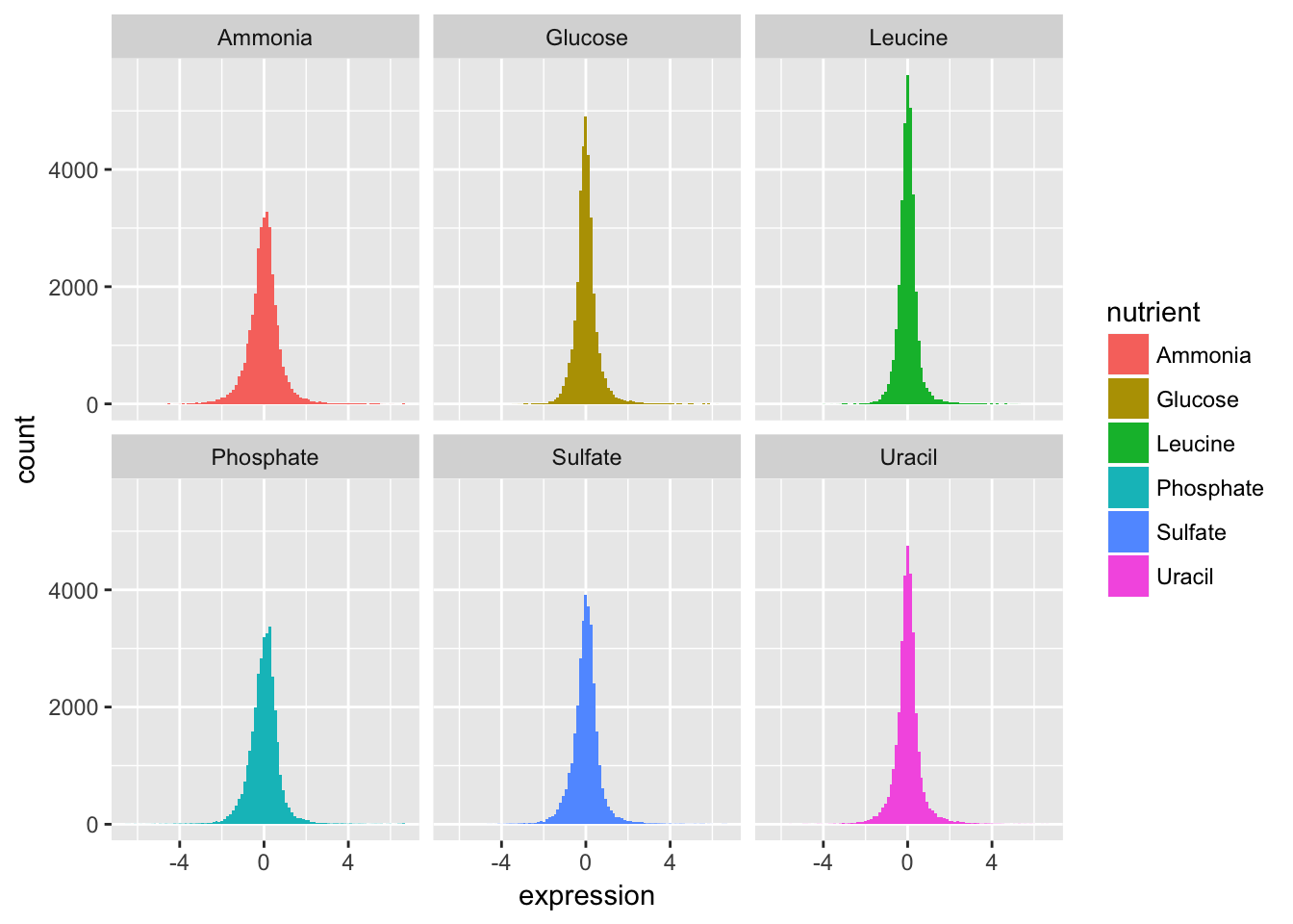
The basic exploratory process above confirms that the overall distribution (as well each distribution by nutrient) is normal.
Part 2
Let’s compare the genes with the highest and lowest average expression values.
We can figure out which these are using some familiar logic:
- Take the original ydat data frame …
- Then group by symbol …
- Then summarize mean of all expression values for that symbol …
- Then arrange descending by the mean …
- Then filter for the first or last row.
The code below implements that pipeline in dplyr syntax:
ydat %>%
    group_by(symbol) %>%
    summarise(meanexp = mean(expression)) %>%
    arrange(desc(meanexp)) %>%
    filter(row_number() == 1 | row_number() == n())
## # A tibble: 2 x 2
## symbol meanexp
## <chr> <dbl>
## 1 HXT3 4.01
## 2 HXT6 -2.68The output tells us that the gene with the highest mean expression is HXT3, while the gene with the lowest mean expression is HXT6.
- Subset the data to only include these genes, and create a stripplot that has expression values as “jittered” points on the y-axis and the gene symbols the x-axis.
HINT you can add a “jitter” position to
geom_point()but it’s easier to control width of the effect if you usegeom_jitter()
gene_exp <-
    ydat %>%
    filter(symbol == "HXT3" | symbol == "HXT6")

ggplot(gene_exp, aes(x = symbol, y = expression)) +
    geom_jitter(width = 0.1)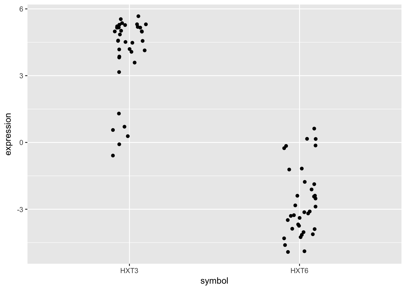
- Now map each observation to its nutrient by color and adjust the size of the points to be 2.
ggplot(gene_exp, aes(x = symbol, y = expression)) +
    geom_jitter(aes(col = nutrient), width = 0.1, size = 2)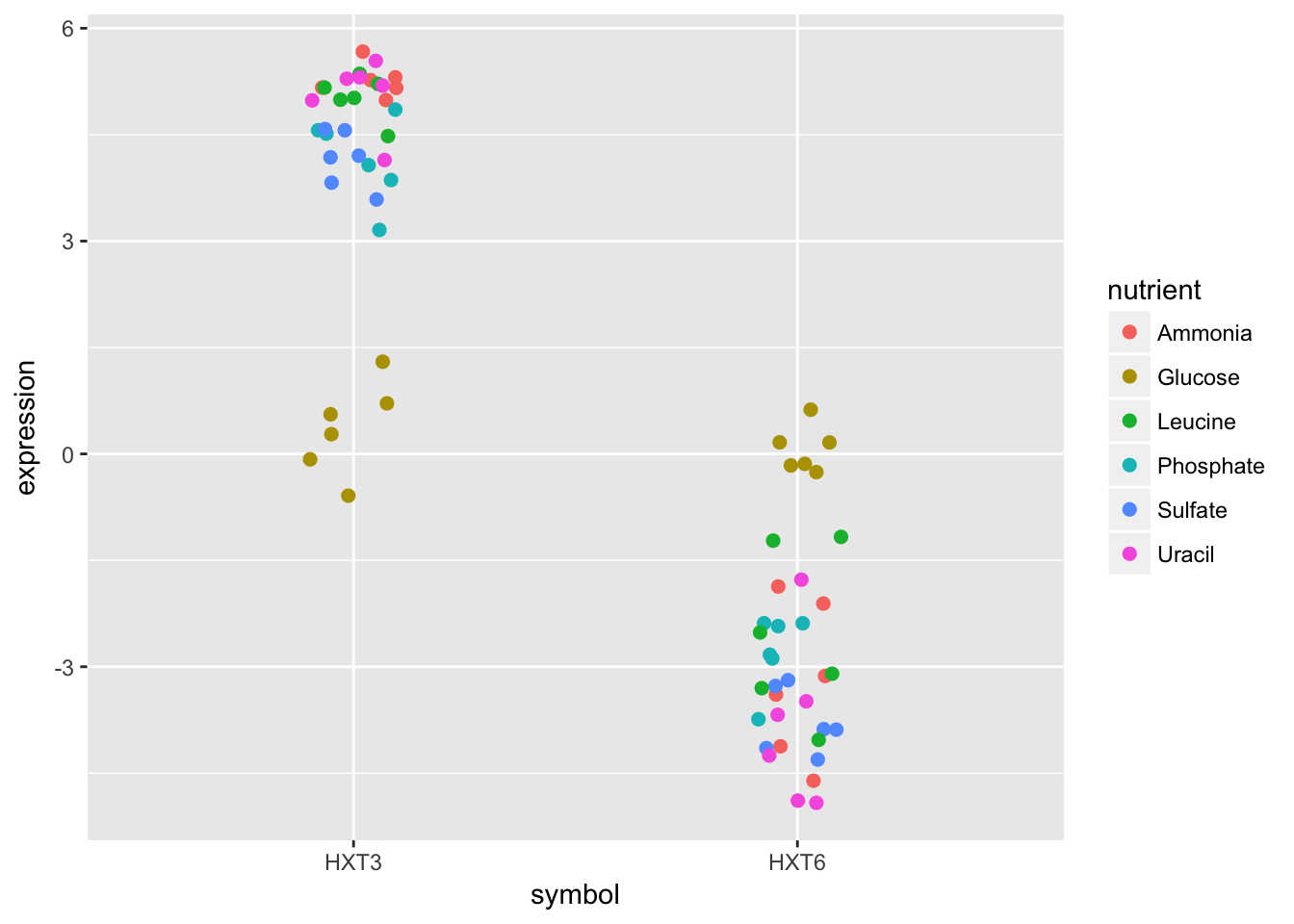
Although these two genes are on opposite ends of the distribution of average expression values, they both seem to express similar amounts when Glucose is the restricted nutrient.
Part 3
Now let’s try to make something that has a little bit more of a polished look.
- Using dplyr logic, create a data frame that has the mean expression values for all combinations of rate and nutrient (hint: use
group_by()andsummarize()). Create a plot of this data with rate on the x-axis and mean expression on the y-axis and lines colored by nutrient.
nutrient_rates <-
    ydat %>%
    group_by(rate, nutrient) %>%
    summarise(meanexp = mean(expression))

ggplot(nutrient_rates, aes(x = rate, y =  meanexp)) + geom_line(aes(col=nutrient))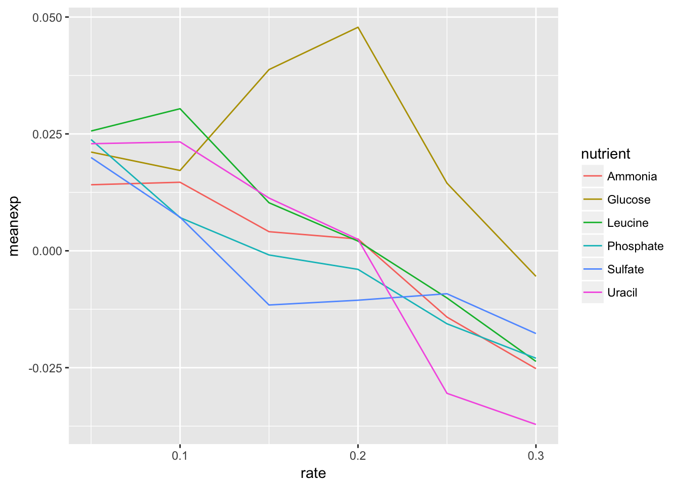
- Add black dotted line (lty=3) that represents the smoothed mean of expression across all combinations of nutrients and rates.
ggplot(nutrient_rates, aes(x = rate, y =  meanexp)) +
  geom_line(aes(col=nutrient), lty=1) +
geom_smooth(col = "black", lty=3, se = FALSE) 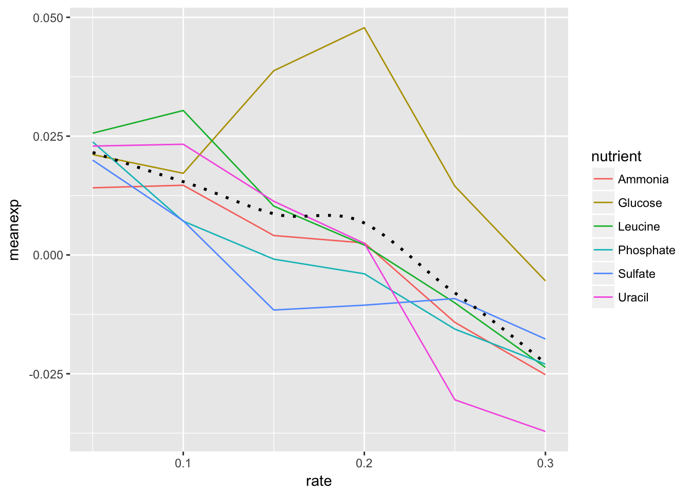
- Change the scale to include breaks for all of the rates.
HINT The
read_csv()function read in the rate variable as continuous rather than discrete. There are a few ways to remedy this, but first see if you can set the scale for the x axis variable without changing the dataframe.
ggplot(nutrient_rates, aes(x = rate, y =  meanexp)) +
  geom_line(aes(col=nutrient), lty=1) +
  geom_smooth(col = "black", se = FALSE, lty=3) +
  scale_x_continuous(breaks = nutrient_rates$rate)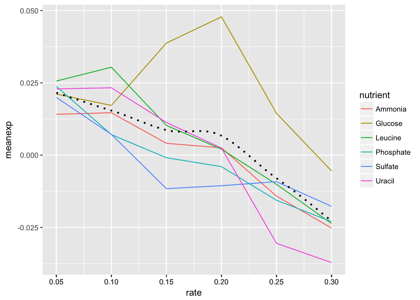
- By default
ggplot()will name the x and y axes with names of their respective variables. You might want to apply more meaningful labels. Change the name of the x-axis to “Rate”, the name of the y-axis to “Mean Expression” and the plot title to “Mean Expression By Rate (Brauer)”
HINT
?labswill pull up the ggplot2 documentation on axes labels and plot titles.
ggplot(nutrient_rates, aes(x = rate, y =  meanexp)) +
  geom_line(aes(col=nutrient), lty=1) +
  geom_smooth(col = "black", se = FALSE, lty=3) +
  scale_x_continuous(breaks = nutrient_rates$rate) +
  xlab("Rate") + ylab("Mean Expression") +
  ggtitle("Mean Expression By Rate (Brauer)")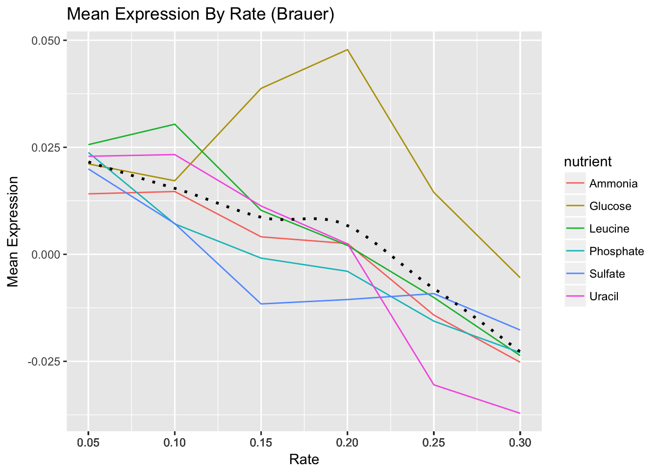
- Add a theme from the ggthemes package. The plot below is based on Edward Tufte’s book The Visual Display of Quantitative Information. Choose a theme that you like, but choose wisely – some of these themes will override other adjustments you’ve made to your plot above, including axis labels.
HINT 1:
library(ggthemes)not working for you? Install the package first.
HINT 2 You can either do this by trial-and-error or check out the package vignette to get an idea of what each theme looks like: https://github.com/jrnold/ggthemes
library(ggthemes)
ggplot(nutrient_rates, aes(x = rate, y =  meanexp)) +
  geom_line(aes(col=nutrient), lty=1) +
  geom_smooth(col = "black", se = FALSE, lty=3) +
  scale_x_continuous(breaks = nutrient_rates$rate) +
  xlab("Rate") + ylab("Mean Expression") +
  ggtitle("Mean Expression By Rate (Brauer)") +
  theme_tufte()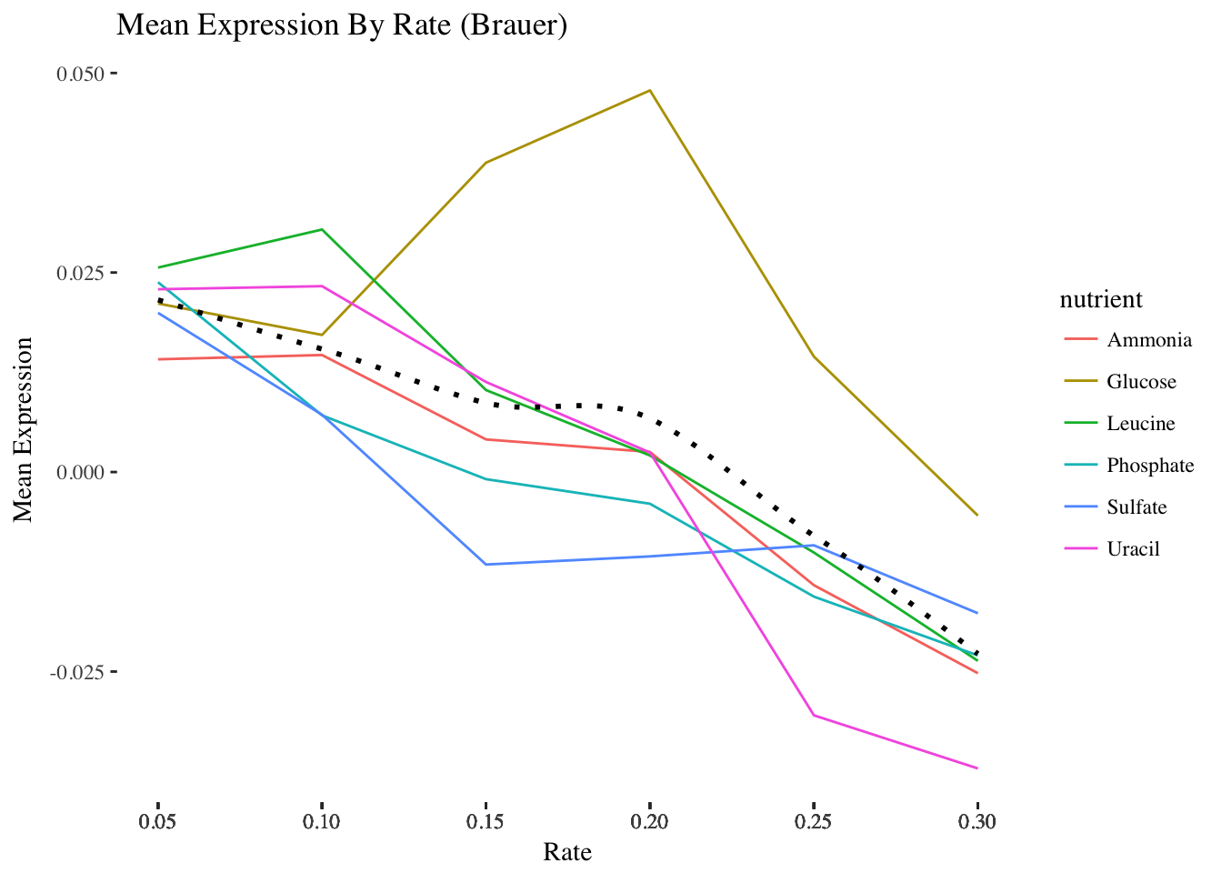
- The last step is to save the plot you’ve created. Write your plot to a 10 X 6 PDF using a ggplot2 function.
p <- ggplot(nutrient_rates, aes(x = rate, y =  meanexp)) +
  geom_line(aes(col=nutrient), lty=1) +
  geom_smooth(col = "black", se = FALSE, lty=3) +
  scale_x_continuous(breaks = nutrient_rates$rate) +
  ylab("Mean Expression") +
  ggtitle("Mean Expression By Rate (Brauer)") +
  theme_tufte()

ggsave(p, filename = "plot.pdf", width = 10, height = 6)